designer as brander
designer as brander
Overview
Designer as Brander is a typographic project that explores the commodification of society through a looping visual system that mimics the language of branding and mass production.
Designer as Brander is a typographic project that explores the commodification of society through a looping visual system that mimics the language of branding and mass production.
Services
printing design
graphic design
animation
Services
printing design
graphic design
animation
Year
2026
Year
2026
Timeline
6 Weeks
Timeline
6 Weeks
Subject
communication design IV - FBAUL
Subject
communication design IV - FBAUL
About this project
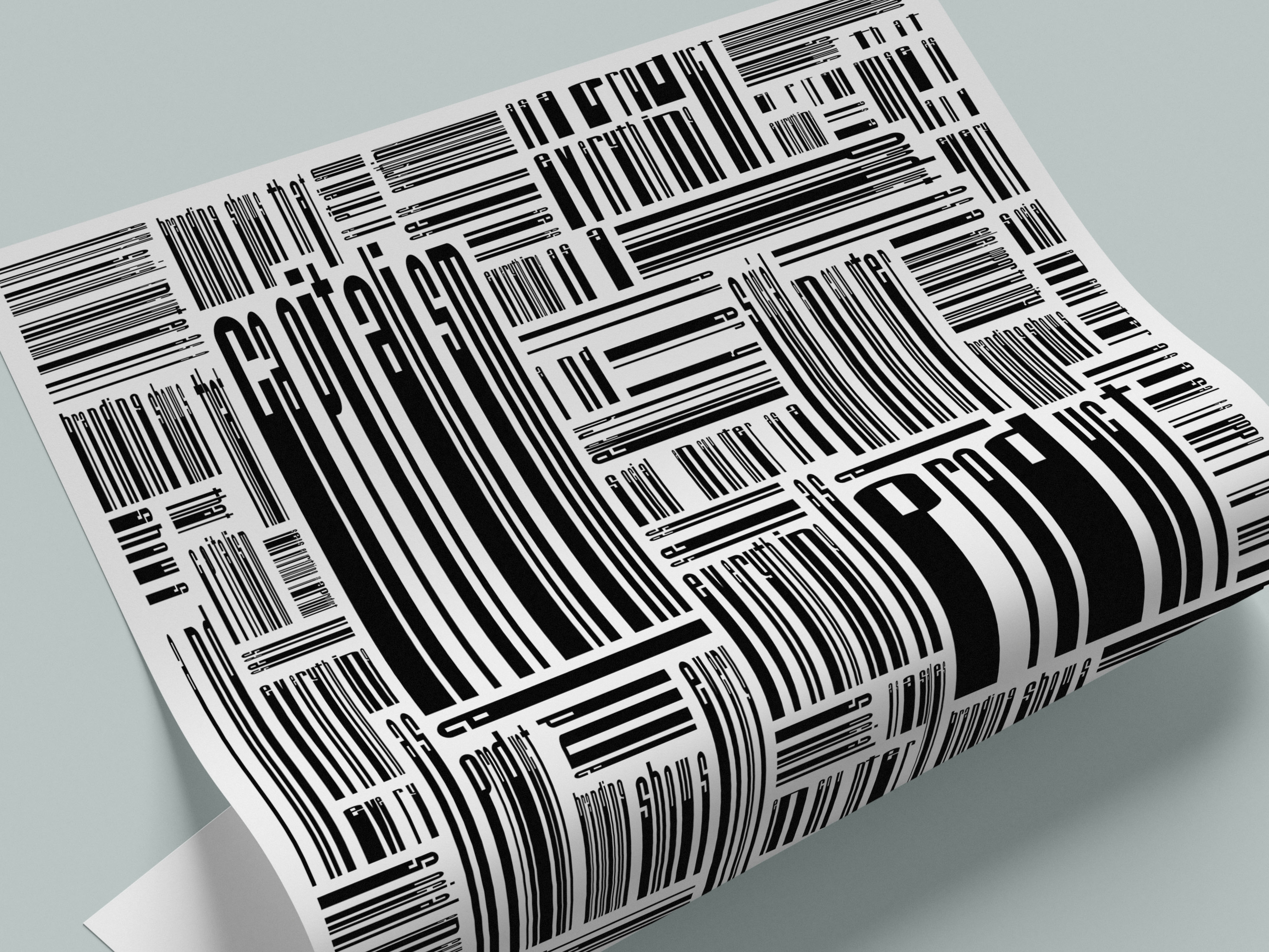
This project is based on a critical reflection on contemporary consumer culture, inspired by Ruben Pater and his text Designer as Brander. The work consists of a poster and a digital animation built from a single quote: “Branding shows that capitalism sees everything as a product, and every social encounter as a sales opportunity.”
The composition transforms this sentence into a dense typographic system, where repetition and fragmentation create a visual language reminiscent of barcodes. As the message becomes increasingly difficult to read, it reflects the saturation and normalization of product-driven logic in everyday life.


Problem
The main challenge was to translate a critical and theoretical idea, the commodification of social life, into a visual system that communicates beyond literal reading.
It required balancing legibility and abstraction, allowing the message to exist while simultaneously being obscured by its own visual construction. Another difficulty was creating a system that could function both as a static composition (poster) and as a temporal experience (animation), while maintaining conceptual consistency.
Solution
The project was developed as a typographic system based on repetition, fragmentation, and accumulation. The original quote was deconstructed and reorganized into a pattern that visually references barcodes, reinforcing the idea of productization. Legibility was intentionally compromised: the message becomes partially unreadable as it dissolves into a visual loop, reflecting how critical content is often absorbed and neutralized by the systems it critiques.
In the animation, this logic is extended into time through a continuous loop, where the composition endlessly repeats itself and where the message is finally revealed. This creates a sense of entrapment, mirroring the inescapable cycle of production and consumption described in the text. By transforming the message into both content and structure, the project positions design not only as a tool of communication, but also as an active participant in the system it critiques.